Did you know that at least 40% of people say that they won’t explore a website if the design is unattractive? Website design is a very important aspect that all website owners should pay close attention to. If your website hasn’t been updated lately, make sure to do it as the website design could be hurting because of it.
In this article, we are going to focus on the do’s and don’ts of website design.
• Do: Optimize Your Content

If your website content is not properly optimized then the chances of ranking on Google’s first page are very slim, almost none existent. Google values well-written content and its values search engine optimization. If you don’t know what SEO does, then look it up because it’s very important to follow the most recent SEO trends and guidelines.
• Don’t: Ignore User Feedback

Users are the people who are regularly visiting your website for the latest insight into your field of expertise. No matter what purpose your website serves, always place yourself in the mindset of your visitors and try to determine what’s wrong with your website from a design point of view. Make sure to recognize any user feedback because it can be the difference of those visitors sticking around or not.
• Do: Make Your Purpose a Focal Point

Depending on the purpose of your website, you should always have a specified place where you would want your visitors to navigate towards on your website. If your website serves the point of an e-commerce store, then the focal point is to make your visitors purchase something. Another example, the focal point of SaaS websites is to make visitors try a demo or a free trial. The focal point of news or magazine websites is to make the visitors click on articles and read. Optimizing your content for the specific purpose of making visitors go towards a specific place will greatly benefit your website, according to experts at Borgerne.
• Don’t: Clutter Content

If there is one thing that people hate when they visit a website, is seeing the content layout cluttered. No one wants to see a row of boxes organized into different shapes and sizes. Some may think that this is edgy and cool but it actually isn’t, in all fairness. Can you try and imagine having to look at different box sizes and having to navigate through all that? No, neither could we, so always make sure that the content layout is as clean as possible.
• Do: Use Specific Colors that Enhance Your Content

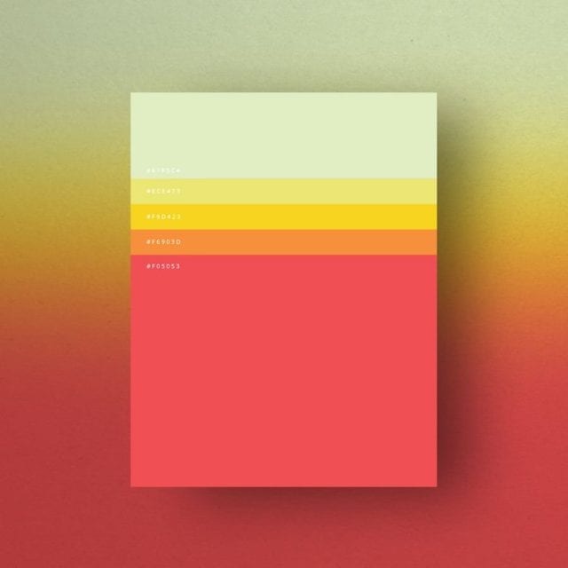
Never use random colors just for the sake of it. The color palette on your website should consist of only those colors that enhance your brand and content. If your website serves the purpose of delivering content to new mothers and their babies, then you can’t really use the color black. If your website serves the purpose of delivering content to men in construction, you can’t really use the color pink, can you?
• Don’t: Use Different Fonts

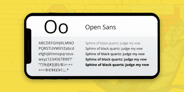
A general rule of thumb is considered to use only one to two fonts maximum for all of your website content. Websites that use more than two fonts (sometimes two is too much) tend to lose visitors pretty quickly due to the difficulty of reading. Too many fonts on a website landing page make the entire website look unprofessional and it gives a chaotic vibe that no one wants to experience. Choose one font for your paragraphs and another one for the title and headings, or go with only one font.


