Wireframing for your apps will not only improve their overall architecture but also make the design and development processes flow smoothly. With good planning, you’ll find that your apps are of a higher quality and will require fewer updates and maintenance. Here are some tips for making a wireframe for an app.
What’s a Wireframe?
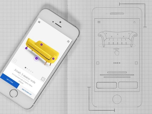
A wireframe is essentially a 2D grayscale representation of what your app’s architecture will look like. In your wireframe, you’ll include all the app’s pages, navigation bar, and any other visual representation of how it will look.
This can be incredibly useful when ironing out details to give clients and developers an idea of how the app should look. The layout of your app will be a crucial component of its success, as hard to navigate or confusing apps often don’t perform well.
Make a Sketch

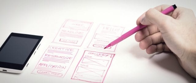
There are two types of wireframes: low-fidelity and high-fidelity. Low-fidelity will contain almost no color, only simple fonts, and can be as simplistic as a black and white drawing on a piece of paper. High-fidelity is usually more aesthetically pleasing, but remember, the purpose of the wireframe is not to show off colors and fonts, but rather the architecture of the app itself.
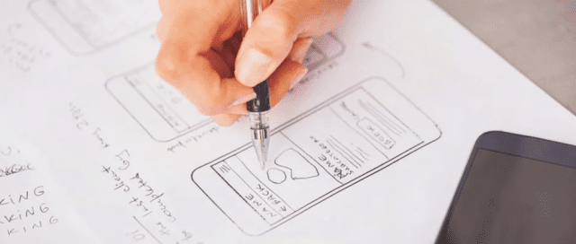
The best place to start in your wireframing process is with a sketch. You don’t have to be a Picasso for your sketch to make sense; you’re simply transferring your ideas onto paper. This is helpful for identifying issues with your blueprint. Maybe what you envisioned doesn’t actually look that great on paper? Or perhaps your app’s structure isn’t quite what you thought it would be?
Once you’ve created a sketch to work from, using wireframe tools to create a digital representation will be a little easier. You can certainly start from scratch in your digital workspace, but a sketch will act as your initial blueprint and a simple way to brainstorm ideas.
The quality of your wireframe tool will play a crucial part in the hand-off to your development team. A good wireframe tool should be cloud-based for easy sharing and editing, and compatible with various third-party design software.
Find the Right Tools

If you’re not already using a blueprinting tool, you should consider it for future designs. Wireframing provides an easy mockup of your design to both clients and the design/development team. The more people who are on the same page, the smoother your design process will flow. Keeping your client in the loop is crucial to the process as well, as they can identify issues and provide feedback throughout the design process. You should consider clients as honorary members of the team, and consult with them frequently. This will ensure you’re delivering the perfect product once it’s completed, to the satisfaction of both your team and your clients.
Finding the right wireframe tools truly depends on the needs of your design team and your own personal preferences. As mentioned earlier, a cloud-based wireframe tool can make sharing with the team a seamless process, and some tools even allow simultaneous editing on the same file. Visit axure.com for more information, as well as access to great wireframe tools and other helpful tips to keep your apps looking professional throughout the design process.
Good Communication Means Better Designs
As with any team-oriented project, creating a wireframe requires communication with both your team and the client. You’ll want to not only gather feedback but let both parties know when changes have been made to the wireframe so that everyone is aware of the latest updates. You’ll find that the more you communicate, the better your team will function as a unit, and the more confident your client will be in your work.
Don’t Forget About UX in Your Design

UX, or user experience, is arguably the most important component of your design. User experience pertains to how the users of your app will feel about the app’s features, design, and functionality. When creating a blueprint for your app, this should be your highest priority. Ask yourself questions such as “if I were using this app, would this feature be irritating?” Put yourself in the shoes of the user to gain a better understanding of what your app should look and function like.
If your app is clumsy and difficult to use, chances are you’ll have trouble keeping users engaged with it. It can be easy to get lost in the design of your app, but sometimes it’s better to focus more on the architecture of the design than the aesthetics. Users will appreciate an app that is slightly less aesthetically pleasing but functions well over one that had all of the effort put into the aesthetics. Looks aren’t everything, especially when it comes to an app or website.
Conclusion
A well-designed app starts with good planning, and for good planning, you need to use a wireframe tool. Without a blueprint for your design, you’re essentially in the dark on how the app will look and function until you develop a prototype. By then, there may be hard-coded issues that could take a lot of time and money to undo. Do yourself, your team, and the client a favor, and always use a wireframe for better, more streamlined and functional designs.


